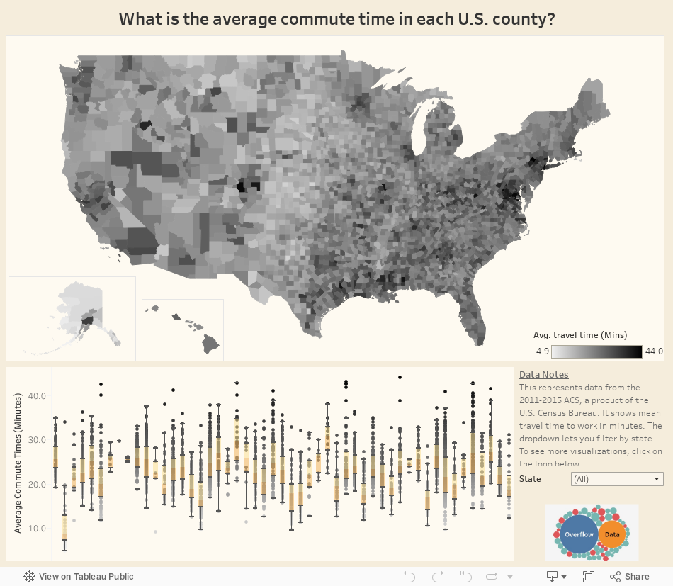
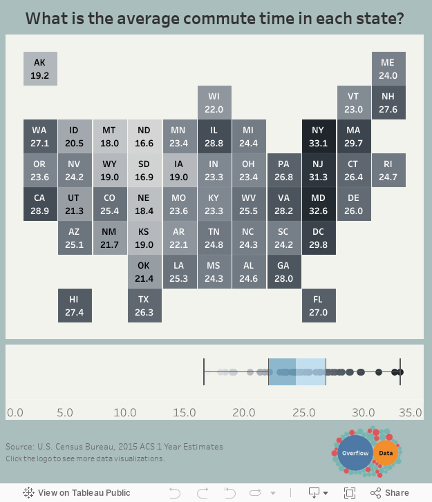
Have you ever wondered how the time it takes for you to get to work compares with the commute of others? These two interactive visualizations from the website Overflow Data show the average commute time for every county (top) and state (bottom) in the U.S. The data is from the American Community Survey (ACS) which is conducted by the U.S. Census Bureau.The top chart provides county-by-county data and the second one provides a state-by-state look. The data refers to mean travel time to work in minutes.