What’s the big trend in logo design this year? According to LogoLounge.com’s annual logo trend report, the proliferation of smartphones is having a tremendous impact on logo design. “The fact that so many people now view the world through a window the size of a business card has spelled an inevitable change in logo design. It used to be that minute favicons had to be kept extremely simple: Now, as a rule, logos must be as well, but that doesn’t mean boring. Designers continue to push back and evolve the meaning of ‘simple.'” says Bill Gardner, creator of LogoLounge.com.
“That logos have to be scalable has always been understood. But our perception of ‘small’ has changed, in some cases ‘tiny’ is being rather generous. Dimension and detail are necessarily removed so that these logos read properly on mobile screens. Designs have become more and more flat. Surfaces are plain and defined by mono-weight lines.”
Some of the trends Gardner notes this year, include:
- Mountains, both representing geographic entities as well as a metaphor for achieving great heights or reaching a summit of success.
- Acorns a plenty, as a return to nature and the promise of potential and greatness from an auspicious beginning.
- Bees in every form, and a few hives as well.
- Digital controllers seem to symbolize the ability to manage any challenge at the push of a button or flick of the wrist.
- Clouds, Wi-Fi waves, loading wheels and a rush of icons from our mobile devices are providing the analogies for the next generation of logo
- Faceting cannot be stopped as it continues to evolve.
- Flat, overly simple logos are giving realism a breather. Skeumorphic design is so yesterday.
Here are a few of the visual trends Gardner notes.
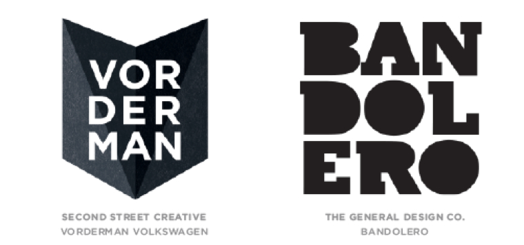
Letter Stacks

Gardner: “Lowly hyphens should abandon hope and designers should be admonished as they lose care for the need to break words between consonants.”
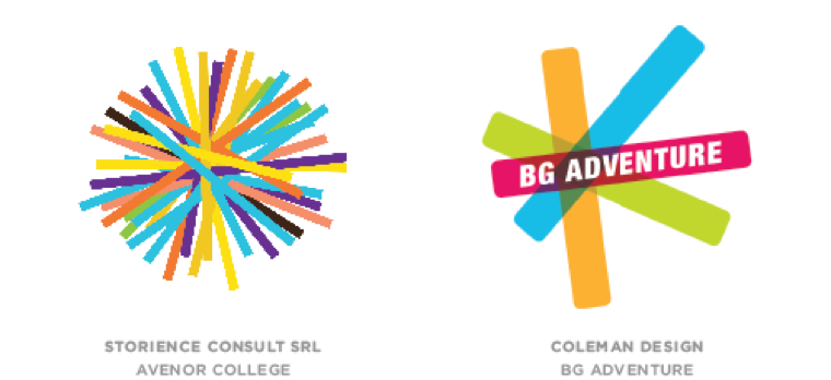
Flat Transparent Animals

Gardner: “In one of the oddest clusters of kindred thinking, the desire to craft beast logos from very flat transparent layers has arrived.”
Pom-poms

Gardner: “No simple balls of fluff, these marks are a series of line segments with a central pivot point. Aside from a common intersection, there are few other rules.”
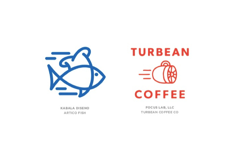
Motion Lines

Gardner: “Everything designers know about demonstrating action they learned from Stan Lee. The most dynamic super hero was just stationary flesh until a few streaks were added for motion.”
Seen any good, new logos lately? Seen any of these trends? If so, add your comments below.
