It’s 2014. If you have a small business, you must have a website. It’s no longer an option. It’s the rule.
And if you looked at as many small business websites as we do, you’d realize another rule needs to be followed: Treat your website like it’s a part of your office or store. You know how you hire a cleaning crew to come in at night and take out the garbage and vacuum the carpet? Treat your website the same way.
Here’s some good news about small business websites: You can do something better than giant companies can with their websites: You can be human. You can interact with customers you know from coaching their kids in Little League. With that much ability to connect with customers, don’t create a website that is sterile and discourages customers from picking up the phone and calling you.
Think of your website as an extension of the experience you would like for customers to have if they walked into your business.
And don’t forget the essentials.
On your small business website, you’ve got to include certain information regarding what your business does and how potential customers can contact you. Beyond that, your website can do lots of different things and serve lots of different purposes. But before you move to cool things, make sure you take care of these essentials:
1. Information to include on your Home Page.
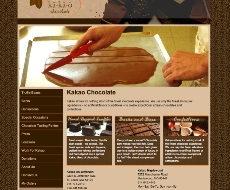
(Photo on kakaochocolate.com)
More important than how it looks (and that’s very important) is what your small business website explains. As in, “What is it that you can do for me?” Notice, we didn’t say the Home page should be about “how great you are.” We said, it should be about “what you do for your customers.” Put yourself in their shoes. They have a challenge, need or desire. What are they looking for as it relates to you? Your home page should address this need and serve as a table of contents for your site.
2. A good navigation bar.
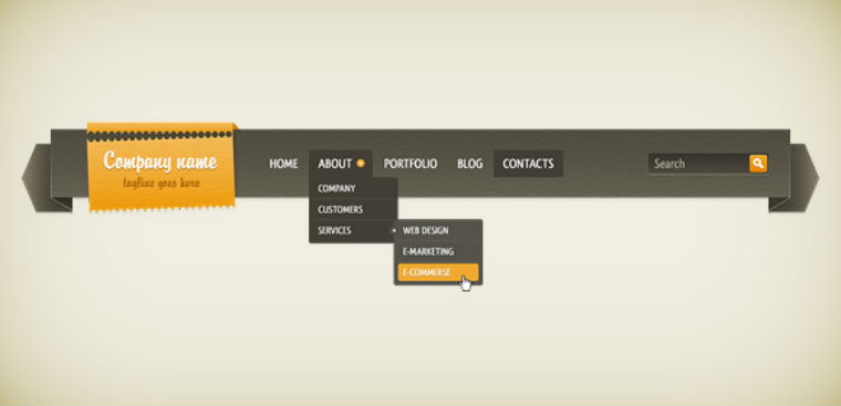
(Image via duckfiles.com)
Help people find their way to the information they seek. One way you can help is to always have a good navigational guide in the form of a bar across the top or down the left side of your small business website. All major website building and hosting platforms have navigational options built in. Use them.
3. Information to include on your Help page.

(Image via wikimedia commons)
We hate to tell you, but when a user clicks on “Help,” it means that you have failed somewhere else on your website. Finding answers to questions is one reason a website exists. The site should be organized and intuitive for the user to find what they seek. On a Help page, visitors expect to see a list of “frequently asked questions.” You may also want to consider adding a special navigational directory that will lead users to the place questions are answered on the site in greater detail.
4. Information to include on your About page.
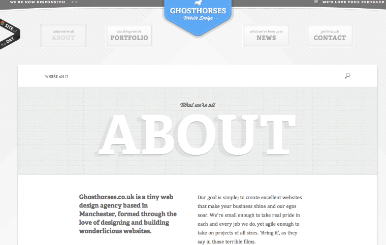
(Image on ghosthorses.co.uk)
Here’s the second place people will look if you fail at telling a customer what you can do for them on the home page. Include: What you do. How long you’ve done it and bit of history. If you want customers to know they’re dealing with a real company (you should), include photos and information about founders and owners and key personnel.
5. Information to include on your Contact Us page.
(Photo via wikimedia commons)
You’re a small business. You are a human being. Don’t have a fill-in-the-blank form that suggests to people they are dealing with a large corporate entity who doesn’t really want to talk with them. On your small business website, give out an email address, your phone number, and directions. Give them your cell-phone number if you really want them to reach you. The idea here is to communicate with customers.
6. Social media links.
(Image via aha-soft-icons on devintart)
On every page of your small business website, include a link and “button” (the little graphic or icon) for the social media channels that you use: Twitter, Facebook, Pinterest, Google+, etc. Then start using those channels to communicate with customers.
7. Include a Photo Gallery.
(Photo via incase on Flickr)
Pictures are said to be worth 1,000 words and though 1,000 plus words on a webpage may send visitors back the way they came, pictures will always keep things simple and easy. Even if your business does not sell its services or products online, photos or images that can show people your products and services, or the business itself will give value to your small business website and better connect it with your physical business. Most website hosting services have a built in means to create photo galleries, however, another way is to use Flickr and then embed slideshows from that service onto blog posts.
8. Include a portfolio or product information page.
(Photo on Circa Interior & Antiques)
A portfolio page is like the “highlights reel” of your your website. It is where you can list and detail past projects your business has worked on. This is an effective way to highlight your company’s products or the ways in which you have served others. Tip: Don’t brag about your company, instead demonstrate passion for what you do. Whenever possible, use case studies so that your customers or clients talk about you, rather than you talking about yourself.
Note: In a future post, we will be exploring e-commerce websites and product pages.


